At NuAxis Innovations, I designed several products over the course of my employment (2012-2015). These include ReachPlus Alerts (shown in the case study below), an internal employee portal (“My NuAxis”), and a redesign of an app that serves as a guide to the national parks (“Parkopolo”).
ReachPlus Alerts is a multi-channel alerting solution that may be accessed through a web-based interface to send alerts to desktop and mobile applications through push notifications, SMS and email. The product is in use at many federal agencies and commercial enterprises around the world including Panasonic, GE Capital, and Hong Kong Shanghai Bank (HSBC).
I have omitted and obfuscated confidential information in the case study below. All statements are my own and do not necessarily reflect the views of NuAxis Innovations.
ReachPlus Alerts is a multi-channel alerting solution that may be accessed through a web-based interface to send alerts to desktop and mobile applications through push notifications, SMS and email. Thus, I designed interfaces for sending alerts (i.e., “the console”) and for receiving alerts (i.e., “the client”). This involved developing a library of icons to represent various emergency situations, a visual system to represent various levels of emergency statuses, and several workflows to cover the various actions of our users. ReachPlus serves 120 existing customers/organizations and had a target revenue of $300,000 in the first year.
As the UX/UI specialist for NuAxis Innovations, I led a team of ten developers to research and plan the design for ReachPlus Alerts. We followed an agile approach, breaking up our work into two-week sprints and daily stand ups. Our primary challenge was communication across the team, since most of our developers worked overseas, in different cultures and timezones. This pushed us, however, to be as clear as possible in the specification of the product’s design.
I designed the logo for ReachPlus Alerts to extend the brand for NuAxis Innovations, employing the same typography and color palette. Like the logo for NuAxis, the ReachPlus logo evokes a multi-faceted approach. The NuAxis mark is composed of three rounded rectangular frames positioned on separate planes, while the ReachPlus logo is composed of three crescent-like shapes positioned on separate planes. To some viewers, the image looks like a globe (representing the product’s world-wide applicability), a bird (representing the product’s ability to speed communication), or a cross (representing the product’s use for life-saving). The logo can operate independently of the word-mark, as it does on the mobile app and on social media.
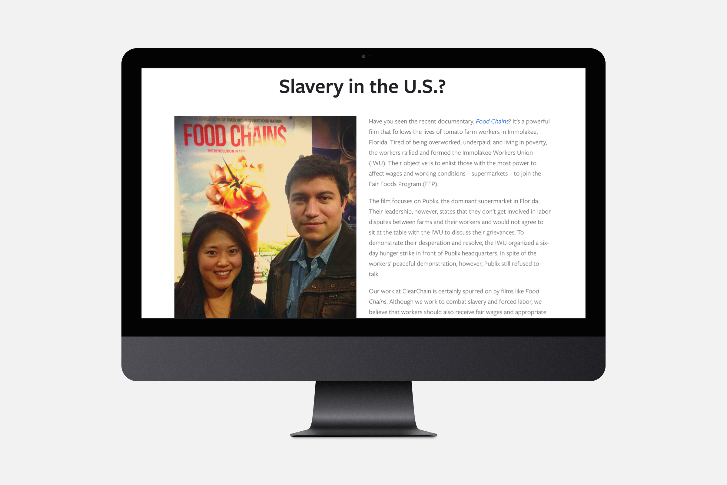
When businesses care about their supply chains, they reduce risk, ensure sustainability, and protect their brand. Clear Chain’s mission is to help businesses thrive by creating supply chains free of slavery and forced labor.
Clear Chain was started by Jennifer K. Hong, anti-trafficking expert at the U.S. Department of State, and a few of her close friends. As a part her team, I provided assistance in strategy, branding, web design, and blogging.
Today, Clear Chain is not an operating business. The website and brand, however, serve as collateral for Jennifer K. Hong’s thought leadership, as she advises companies and speaks on eradicating human trafficking. The site can be viewed here.
Since Clear Chain is a startup with minimal funding, I employed a number of open-source images in the website’s design. They were selected to represent the world-wide breadth of instances where slavery might occur in supply chains. They were also selected to stir the emotions, giving the viewer a sense of the injustice that can arise when companies fail to conduct due diligence.
Jennifer K. Hong led the team in developing a business plan. My role was to facilitate communication of Clear Chain’s value. I helped the team translate services (e.g., “investigative research”, “reinforce supply chain integrity”, “fortify continuous monitoring”) into benefits that matter to companies (e.g., “reduce uncertainty”, “increase sustainability”, “protect and promote your brand”). This process informed the design of the website and unified the team around a shared vision.
My main goal for Clear Chain’s website was to enable users to connect with Jennifer K. Hong. This is the user’s primary call to action. It was achieved by providing a newsletter sign up in the footer, which persists throughout the site. A contact form on the team page, moreover, makes it easy for users to get in touch. The site has been effective toward that end.
My goal was to make Clear Chain’s logo simple, yet powerful. The viewer sees two links in a chain. This chain could represent a supply chain or the chains of slavery. The links are not closed, however. This evokes more visual depth, showing that the chains are interlocking. It also, of course, represents the two “C”s of the company name, “Clear Chain”. Finally, the links might appear broken to some viewers, hinting that the chains of slavery are being broken, setting people free. The circle that surrounds the links serves as a window, making the viewer a supply chain inspector. In the image above, I explored various weights to the logo, settling on the middle of the three.
Clear Chain’s blog features the writing of Jennifer K. Hong, anti-trafficking expert at the U.S. Department of State. I provided graphic design, photography, and editing. With the other members of the team, I also served as a contributing author; which helped me learn more about how to combat human trafficking.
ClearChain is moving forward. Recently, Jennifer Hong was asked to speak at TEDx Cesena, to share her knowledge and expertise. Her talk can be viewed here.
Mighty Cause (formerly “Razoo”) has helped over 150,000 causes raise more than $600 million. I served as Product Operations Analyst and Print & Production Artist (2010-2012). At Mighty Cause, I was first exposed to a lean startup approach and to an agile software development methodology.
Since MightyCause was a small startup, I wore many hats. One day, I would be making sales calls; on another day, I would be designing product pages or marketing materials. It was a fun and exciting introduction to the world of technology.
In the example below, I designed a banner for a state-wide “Giving Day”, which raised over $14 million in the previous year. The banner intends to bring excitement for generosity and to promote the company brand, through the prominent display of the logo and color palette. The banner was effective in helping Mighty Cause become an industry leader in 24-hour online giving marathons.
In 2015, I designed an infographic for Deloitte’s campaign to improve customer experience in government. The content was based on a survey conducted by Government Business Council (GBC). It revealed how important it is for agencies to work together, improve communication, and take a holistic approach.
I provided two versions for the client (shown on the left). They preferred the version with the photograph serving as the background (top). Although this version is “busier”, it makes a stronger impact through the use of imagery, which is what the client desired.
Although the infographic was a simple project, it gave me opportunity to hone my experience as a freelance designer. Through it, I learned how to communicate design decisions and work with others toward a common vision.
In 2015, I was asked to submit a logo for a new church in Silicon Valley called “Current SV”. Since their budget was tight, they decided to hold a contest, rather than hire a designer. I entered the contest, hoping (at least) to develop my skills as an illustrator.
The design intends to give the church members a sense of “place” by referencing the Golden Gate Bridge. Christian elements are subtly evoked. The cables of the bridge form a cross. The sun against the fog is reminiscent of God’s presence.
The church leadership team was impressed by the design but decided to go in another direction. In hindsight, the illustration is perhaps too complex to serve as an effective logo. Nevertheless, it is pleasing to look at and to contemplate. For me, it serves as a reminder to work closely with clients toward a common vision.